 |
| This is what you saw when you walked into the kitchen from the dining room. Take note of the awesome border, window treatments, green laminate counters, and sweet clock. |
 |
| And this is the view from standing with your back to the window. The border really stands out in this picture. And makes me so grateful for the work we've done so far! |
I don't have any pictures of our current kitchen, but the appliances are mostly the same (except for the dishwasher which we replaced with a stainless steel version), the border is gone, and the walls were painted with something like this color from Sherwin Williams (unfortunately I can't remember the name of the exact shade we used). It's a very light gray-green shade that actually brightens the room a bit.
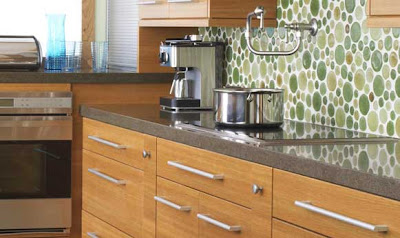
Anyway, ideally, we'll end up replacing all of the other appliances at some point with all stainless ones, and we'll change the counter tops to something more durable than laminate (I'm thinking an engineered stone material) and adding a backsplash to boot. Here's my inspiration for both:
So, what do you think? Comments, suggestions, general opinions are welcome. I'm not really known for my interior design capabilities...so all input is appreciated. :)


No comments:
Post a Comment